Posts

Installation:
Data communication through visualization

Check out Lauren Manning's installation/survey about data visualization methods. She has created and mounted 40-odd versions of a big yet easy-to-understand data set. Viewers can show her which versions attracted them most strongly, got them thinking, and so forth by marking up "experience cards" that show the array in miniature. My own faves tend to be those that illustrate the proportions of different foods in fresh ways (mostly in the Abstract/Complex quadrant of her matrix ), rather than just showing images and labeling them with numbers (the Simple/Literal quadrant). Among those I like best: Food by Line Weight Concentric Circles Shaded Box Chart Stacked Bar Chart and Mini Months At the same time, I found a few of the formats hard to grasp; one such is the Rainbow Diagram Full Circle . I don't understand the purpose of the connections or the meaning of the line width. It needs a legend, at the very least. Still, the photoset/installation...
Some people are tired of all the debt charts.

Alex Pareene, at Salon, for one: I can explain the magnitude of the federal debt pretty easily: The recession caused revenue to plummet, and tax rates have been very low for years. Plus wars. But I explained that with words. Who reads words? No one, unless those words have lines next to them, or colored bars. America's Deficit Chart Surplus -- Salon

US debt charts of note

Image
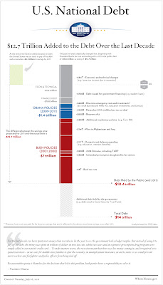
On Sunday, July 24, the New York Times ran a chart illustrating the fiscal results of national policy. Given the fierceness of the ongoing debt-ceiling debate, the chart got picked up and disseminated through the web, and with good reason: It's clear, it's straightforward, and it communicates something very important. (By the way, I have it on good authority that this was the first instance of color being used on the NYT editorial page.) You can see the chart here . Now, finally, comes the White House with this graphic : The Atlantic 's James Fallows likes it , but I'm less impressed. First of all, from a political point of view, it's a bit late to release this; the chart could/should have focused the congressional debate and the public discourse weeks ago. Secondly, despite the telltale Tufte-style typefaces and additional detail, it's not as intuitively readable as the Times' version. The timeline, such as it is, runs vertically, while the magni...

Quality dataviz about quality-of-life issues

Image
To accompany its Better Life Initiative , OECD (the Organization for Economic Co-operation and Development) has put up a handsome, carefully constructed set of interactive data graphics called the Better Life Index : There is more to life than the cold numbers of GDP and economic statistics – this Index allows you to compare well-being across countries, based on 11 topics the OECD has identified as essential, in the areas of material living conditions and quality of life. Each country is represented by a multicolored flower with 11 petals (OK, yes, potentially cheesy). The length of each petal represents the country's score in a given area; the width of the petal indicates the importance the user has assigned to that particular aspect. Drilling down into the details is easy to do; in fact, if you've a mind to do your own visualizations of this info, the underlying index data can be downloaded in spreadsheet format. Kudos to Moritz Stefaner , Jonas Leist and Timm Kekeritz (...

Infoviz in 2011: a status report

"I predict that we will see a lot more visualization in journalism. A lot of stories are already about numbers, with language mostly telling readers the conclusions. Simple charts with some interaction can provide a bit more context, and more can be added very easily. I doubt that we'll see a big visual journalism revolution in 2011, mostly because of the lack of accessible and practical tools, but we will see a lot more experimentation. The increasing demand will lead to more journalism-focused services being provided by visualization websites, in particular ones that also provide the analytic capabilities (i.e., not just pretty charts)." -- from " The State of Information Visualization, 2011 ," by UNC Charlotte's Robert Kosara . Emphasis added, as this is exactly What We Do here at Synoptical Charts.

Cool Map: Emissions worldwide

Image
From the Center for Public Integrity comes this interactive map showing greenhouse gas emissions from many of the world's largest economies. Lots of data is packed into this simple interface, and the map itself is blessedly clear. Note, though, that when it comes to infoviz issues, even these pros needed a do-over. Check out the message in the lower left corner. In an earlier version they made the common mistake of comparing circles based on radius, instead of by area. It's to their credit that not only did they fix the mistake, but they also owned up to it and made the change. The larger problem, though, is that distinguishing the relative size of circles is not easy for the average viewer; rectangles are clearer, and would probably have made this cool map even stronger. Note also that stats are from 2005. Since then there's been substantial economic growth in China (for example), so the current numbers are likely to be even higher than what's shown here. Diffe...

Cool Map: Lincoln's county-by-county map of slave population

Image
A sobering look at U.S. social conditions, circa 150 years ago. Notice how concentrated slave ownership is in the areas surrounding the major rivers (the Mississippi Delta is one obvious example) and near the largest ports (Houston, the Chesapeake region, Charleston). If you want more detail, there's a full frame version  courtesy of the New York Times .