US debt charts of note
On Sunday, July 24, the New York Times ran a chart illustrating the fiscal results of national policy. Given the fierceness of the ongoing debt-ceiling debate, the chart got picked up and disseminated through the web, and with good reason: It's clear, it's straightforward, and it communicates something very important. (By the way, I have it on good authority that this was the first instance of color being used on the NYT editorial page.) You can see the chart here.
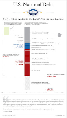
Now, finally, comes the White House with this graphic:
The Atlantic's James Fallows likes it, but I'm less impressed.
First of all, from a political point of view, it's a bit late to release this; the chart could/should have focused the congressional debate and the public discourse weeks ago.
Secondly, despite the telltale Tufte-style typefaces and additional detail, it's not as intuitively readable as the Times' version. The timeline, such as it is, runs vertically, while the magnitude is also mapped along the Y-axis. That's confusing. Also, using the X-axis to delineate surplus vs. debt would work better if there were more than two columns shown (i.e., where is the historical context?). Conceptually it's a little muddy, too; the X-axis suggests a timeline, because the left column expresses info from an earlier era.
Still, despite these small graphic issues and the very grim news that's expressed, it's good to see infoviz taking an important role in national discussions. For me, it's one small reason to be cheerful.
Now, finally, comes the White House with this graphic:

The Atlantic's James Fallows likes it, but I'm less impressed.
First of all, from a political point of view, it's a bit late to release this; the chart could/should have focused the congressional debate and the public discourse weeks ago.
Secondly, despite the telltale Tufte-style typefaces and additional detail, it's not as intuitively readable as the Times' version. The timeline, such as it is, runs vertically, while the magnitude is also mapped along the Y-axis. That's confusing. Also, using the X-axis to delineate surplus vs. debt would work better if there were more than two columns shown (i.e., where is the historical context?). Conceptually it's a little muddy, too; the X-axis suggests a timeline, because the left column expresses info from an earlier era.
Still, despite these small graphic issues and the very grim news that's expressed, it's good to see infoviz taking an important role in national discussions. For me, it's one small reason to be cheerful.


Comments
Post a Comment