
At a glance: How soon can I get there?

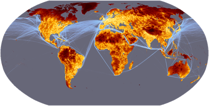
A new map of Travel Time to Major Cities - developed by the European Commission and the World Bank - captures this connectivity and the concentration of economic activity and also highlights that there is little wilderness left... accessibility is relevant at all levels, from local development to global trade and this map fills an important gap in our understanding of the spatial patterns of economic, physical and social connectivity.
The creators of this map went beyond simple considerations of road mileage and cities' distance from the coast to calculate a more complex measure of "friction surface" — in other words, how long it really takes to cover a given mile of terrain. Among the other factors that add to travel time (i.e., friction) are topography, national borders (the crossing of which can cause delays), and land cover. (Check out the data sources page to see where all that information originated, and what the data's parameters are.)

Kudos to the mapmakers for the aesthetic choices, too. The coloration is coherent and seamless, yet the viewer can easily distinguish among the zones. The gradual transitions from one zone to the next are clear.

This is a very thoughtful project that goes beyond careful data selection to incorporate practical considerations as well — thereby creating a very useful tool.

Travel time to major cities: A global map of Accessibility — European Commission Global Environment Monitoring

[Via enrevanche]

Comments

Popular posts from this blog

I want to be Jorge Camoes when I grow up.

Portuguese infoviz enthusiast Jorge Camoes has spent the last year and a half writing informed, insightful blog posts on the field, complete with examples and citations. To his credit, he approaches everything -- even the revered work of Edward Tufte and Stephen Few -- with loving skepticism. I'm gratified, too, that he seems to agree with me on one central point: Snazzy tools alone don't get you good data visualization. It all comes down to putting serious thought into the project before you plot the first data point. In future posts we'll discuss more of Jorge's ideas. Bem feito, o Sr. Camoes!

Everybody loves visual information — especially Abraham Lincoln.

Infographics are clearly having a cultural moment. They have become pervasive in newspapers, magazines, blog posts, and viral tweets; they appear on television and in advertising, in political campaigns and at art openings. As a Google search term, “infographic” has increased nearly twenty-fold in the last five years. Yet infographics have been popular, in one form or another, for centuries. The source of their power isn’t computers or the Internet, but the brain’s natural visual intelligence. Gareth Cook , the editor of Best American Infographics 2013 , has put together a short but true summary of the history of information graphics. (Many of you who see this blog may know most of it already.) His striking lede recounts how much Abraham Lincoln valued his "slave map," shown above. Lincoln's reliance on the shades of gray throughout the Confederacy made an enormous difference in his Civil War decision-making. Fortunately it's rare that most people have to make l

Hype and backlash:
visualizing pop culture trends

Back in 2005, the astute pop-culture chronicler Adam Sternbergh pointed out that a person's opinion of any given entertainment product depends largely on how long they've been aware of it — that is, where the product sits on the sine-wave timeline of public expectations (aka buzz). His findings, in chart form: "Welcome to the undulating curve of shifting expectations—the Heisenbergian principle by which hype determines how much you enjoy a given pop-culture phenomenon. The first-wave audience is pleasantly surprised, but the second-wavers feel let down; then the third wave finds it’s not as bad as they’ve heard—and they’re all watching the exact same show." Almost five years later, this pattern describes just about all our collective experiences. Sports fans, how much sweeter was it to watch the New Orleans Saints come out of nowhere to win the NFC championship than to have seen the Minnesota Vikings do it for the umpteenth time? As for politics, consider the poll