Posts

Recommended: a new review "zoo"

"A Tour Through the Visualization Zoo" is a fantastic introduction to some attractive and sophisticated new visualization formats. The article and illos were put together by Stanford's Jeffrey Heer, Michael Bostock, and Vadim Ogievetsky. Heer is an HCI/visualization genius whose journal articles I've been following with interest; Bostock is the whiz behind the D3 archive of javascript code for visualization. Run, don't walk. It's great.

Sociological mapping on a grand scale in London

Booth’s Maps are important documents of mass poverty, but by drilling down and giving huge amounts of detail, they do more than analyze it statistically,” said Beverly Cook, curator of social and working history at the Museum of London. “Many writers and artists of the time saw London as a divided city, split between rich and poor, but these maps show its complexities. In many respects, they give a more realistic portrayal of working class life in London than Charles Dickens’s novels. By making something so complicated seem straightforward, Booth’s Poverty Map was also a triumph of information design. It fulfilled one of design’s most useful functions — helping us to make sense of the world — by distilling an avalanche of information into a clear, coherent form. An Early Triumph in Information Design - NYT.com

Resource recommendation: an "illustrated chronology of innovations"

Michael Friendly and Daniel J. Denis have a wonderful interactive timeline on milestones in the theory and practice of data visualization. Be prepared to spend a lot of time there; it's a deep well. Milestones in the History of Thematic Cartography, Statistical Graphics, and Data Visualization

Installation:
Data communication through visualization

Check out Lauren Manning's installation/survey about data visualization methods. She has created and mounted 40-odd versions of a big yet easy-to-understand data set. Viewers can show her which versions attracted them most strongly, got them thinking, and so forth by marking up "experience cards" that show the array in miniature. My own faves tend to be those that illustrate the proportions of different foods in fresh ways (mostly in the Abstract/Complex quadrant of her matrix ), rather than just showing images and labeling them with numbers (the Simple/Literal quadrant). Among those I like best: Food by Line Weight Concentric Circles Shaded Box Chart Stacked Bar Chart and Mini Months At the same time, I found a few of the formats hard to grasp; one such is the Rainbow Diagram Full Circle . I don't understand the purpose of the connections or the meaning of the line width. It needs a legend, at the very least. Still, the photoset/installation

Some people are tired of all the debt charts.

Alex Pareene, at Salon, for one: I can explain the magnitude of the federal debt pretty easily: The recession caused revenue to plummet, and tax rates have been very low for years. Plus wars. But I explained that with words. Who reads words? No one, unless those words have lines next to them, or colored bars. America's Deficit Chart Surplus -- Salon

US debt charts of note

Image
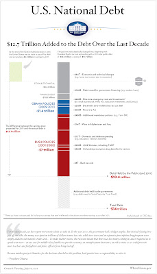
On Sunday, July 24, the New York Times ran a chart illustrating the fiscal results of national policy. Given the fierceness of the ongoing debt-ceiling debate, the chart got picked up and disseminated through the web, and with good reason: It's clear, it's straightforward, and it communicates something very important. (By the way, I have it on good authority that this was the first instance of color being used on the NYT editorial page.) You can see the chart here . Now, finally, comes the White House with this graphic : The Atlantic 's James Fallows likes it , but I'm less impressed. First of all, from a political point of view, it's a bit late to release this; the chart could/should have focused the congressional debate and the public discourse weeks ago. Secondly, despite the telltale Tufte-style typefaces and additional detail, it's not as intuitively readable as the Times' version. The timeline, such as it is, runs vertically, while the magni

Quality dataviz about quality-of-life issues

Image
To accompany its Better Life Initiative , OECD (the Organization for Economic Co-operation and Development) has put up a handsome, carefully constructed set of interactive data graphics called the Better Life Index : There is more to life than the cold numbers of GDP and economic statistics – this Index allows you to compare well-being across countries, based on 11 topics the OECD has identified as essential, in the areas of material living conditions and quality of life. Each country is represented by a multicolored flower with 11 petals (OK, yes, potentially cheesy). The length of each petal represents the country's score in a given area; the width of the petal indicates the importance the user has assigned to that particular aspect. Drilling down into the details is easy to do; in fact, if you've a mind to do your own visualizations of this info, the underlying index data can be downloaded in spreadsheet format. Kudos to Moritz Stefaner , Jonas Leist and Timm Kekeritz (