Posts

Showing posts with the label Politics

Everybody loves visual information — especially Abraham Lincoln.

Image
Infographics are clearly having a cultural moment. They have become pervasive in newspapers, magazines, blog posts, and viral tweets; they appear on television and in advertising, in political campaigns and at art openings. As a Google search term, “infographic” has increased nearly twenty-fold in the last five years. Yet infographics have been popular, in one form or another, for centuries. The source of their power isn’t computers or the Internet, but the brain’s natural visual intelligence.  Gareth Cook , the editor of Best American Infographics 2013 , has put together a short but true summary of the history of information graphics. (Many of you who see this blog may know most of it already.) His striking lede recounts how much Abraham Lincoln valued his "slave map" (featured in an earlier blog post ). Lincoln's reliance on the shades of gray throughout the Confederacy made an enormous difference in his Civil War decision-making.  Fortunately it's rare that mos...
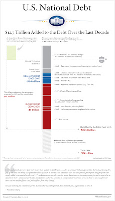
Some people are tired of all the debt charts.

Alex Pareene, at Salon, for one: I can explain the magnitude of the federal debt pretty easily: The recession caused revenue to plummet, and tax rates have been very low for years. Plus wars. But I explained that with words. Who reads words? No one, unless those words have lines next to them, or colored bars. America's Deficit Chart Surplus -- Salon

US debt charts of note

Image
On Sunday, July 24, the New York Times ran a chart illustrating the fiscal results of national policy. Given the fierceness of the ongoing debt-ceiling debate, the chart got picked up and disseminated through the web, and with good reason: It's clear, it's straightforward, and it communicates something very important. (By the way, I have it on good authority that this was the first instance of color being used on the NYT editorial page.) You can see the chart here . Now, finally, comes the White House with this graphic : The Atlantic 's James Fallows likes it , but I'm less impressed. First of all, from a political point of view, it's a bit late to release this; the chart could/should have focused the congressional debate and the public discourse weeks ago. Secondly, despite the telltale Tufte-style typefaces and additional detail, it's not as intuitively readable as the Times' version. The timeline, such as it is, runs vertically, while the magni...

Cool Map: Emissions worldwide

Image
From the Center for Public Integrity comes this interactive map showing greenhouse gas emissions from many of the world's largest economies. Lots of data is packed into this simple interface, and the map itself is blessedly clear. Note, though, that when it comes to infoviz issues, even these pros needed a do-over. Check out the message in the lower left corner. In an earlier version they made the common mistake of comparing circles based on radius, instead of by area. It's to their credit that not only did they fix the mistake, but they also owned up to it and made the change. The larger problem, though, is that distinguishing the relative size of circles is not easy for the average viewer; rectangles are clearer, and would probably have made this cool map even stronger. Note also that stats are from 2005. Since then there's been substantial economic growth in China (for example), so the current numbers are likely to be even higher than what's shown here. Diffe...

How Americans have done financially since 1940

Image
"Aughts were a lost decade for US economy, workers" - Washington Post

Infographic of the day:
Airborne Terror

Image
"The True Odds of Airborne Terror" chart - Gizmodo

Anatomy of a deficit

Image
The "socially liberal, fiscally conservative, and academically rigorous" (per CQ) Center on Budget and Policy Priorities presents this (literally) graphic depiction of the U.S. government deficit over the next decade. The deficit for fiscal 2009 was $1.4 trillion and, at an estimated 10 percent of Gross Domestic Product (GDP), was the largest deficit relative to the size of the economy since the end of World War II. Under current policies, deficits will likely exceed $1 trillion in 2010 and 2011 and remain near that figure thereafter.... The recession battered the budget, driving down tax revenues and swelling outlays for unemployment insurance, food stamps, and other safety-net programs. Using CBO’s August 2008 projections as a benchmark, we calculate that the changed economic outlook accounts for over $400 billion of the deficit in 2009 and slightly smaller amounts in subsequent years. Those effects persist; even in 2018, the deterioration in the economy since summer 200...

Infoviz fail

Image
[Image from " Keventhepang " on Twitter; via Wonkette .]

Marijuana math

Image
In a New York Times op-ed back in May, Reason.com editor Nick Gillespie pondered the fiscal consequences of legalizing "victimless" crimes such as prostitution, gambling and drugs: [Here's a way to] help the federal and state governments fill their coffers: Legalize drugs and then tax sales of them. And while we’re at it, welcome all forms of gambling (rather than just the few currently and arbitrarily allowed) and let prostitution go legit too. All of these vices, involving billions of dollars and consenting adults, already take place. They just take place beyond the taxman’s reach... Turning America into a Sin City on a Hill could help President Obama pay for his ambitious plans to overhaul health care and invest in green energy. More taxed vices would certainly lead to significant new revenue streams at every level. Now the folks at nightlife site Sloshspot.com have taken some data from NORML and various U.S. government agencies and created this : Not bad, I think...

IV and the news: Iran election data

As thousands and perhaps millions take to the streets in Tehran to protest Iran's (alleged) election fraud, the UK's Guardian goes nitty-gritty, posting a data set of polling results. * The paper ends its report thus: "Can you do something with this data? Please post us your visualisations and mash-ups below or mail us at datastore@guardian.co.uk ." Its story also links to data maps from Fivethirtyeight.com and Iran Tracker. (Elsewhere at Fivethirtyeight, Nate Silver considers the statistical analysis that ostensibly proves the election was rigged -- in other words, the basis of the protestors' unrest.) Here's the direct link to the election data, in case anyone out there feels like having a go at it; I hope I'll have some time to muck around with it myself. DATA: Full Iranian election results by province including turnouts and 2005 results. Download them as a spreadsheet. *Per the story: "The figures we've uploaded are, as far as we can work...

Blast from the past: a 1974 data treatise by Edward Tufte

Back in 1974, Yale poli-sci professor Edward Tufte published a slim volume called Data Analysis for Politics and Policy (Prentice-Hall, $3.95). The book in its entirety is available for free download (PDFs) at Tufte's website, accompanied by a contemporary review from the Journal of the American Statistical Association . More than 30 years later, the review amuses me with its restrained praise of the perspective that would eventually make Tufte a Major Figure (and a minor fortune ): Tufte puts residual plots to good use to gain understanding of a data set, and he shows how finding outliers gives the analyst hints about the inadequacy of a statistical model... The discussion of graphical techniques in general is quite good... A brief but compelling discussion of the "value of data as evidence ," with regard to the interpretation of nonrandom samples, is presented. If you happen to have a spare 48MB lying about, DAPP 's worth a download. [via Sofa Papa ]

Tax-rate charts, intermural division

John Cole gets his infoviz on and illustrates the actual quantitative difference "between socialism and capitalist nirvana." His bar graph demonstrates that, political rhetoric notwithstanding, the proposed increase for top-bracket taxpayers doesn't exactly warrant the dreaded S word.

Transparency in government:
New US CIO is an infoviz fan

Appointed earlier this week by President Obama, 34-year-old Vivek Kundra is the U.S.'s new Chief Information Officer. Since 2007, Kundra’s group in the DC municipal government [where he had been CTO] has been using a data-visualization package from Tableau Software... Kundra’s group [created] charts and graphs for its CapStat program, which has received a fair bit of attention as a way to present trends and analysis to the general public on municipal issues like crime, disaster response, school security, and city maintenance. The program is one of the ways in which Kundra has been recognized in his efforts to make the workings of the DC government more transparent... Obama’s hope is that Kundra will also help bring more transparency to the federal government. One way this could potentially happen is through websites like Recovery.gov , which was set up to explain the American Recovery and Reinvestment Act. The intent of the site is to show how, when, and where money from the fed...

See How I Feel: No love for CEOs

Justin Wehr harvests some stats from a Rasmussen Report and shows us who Americans hate the most. Surprise: it's not lawyers, journalists or even Congresspeople. "Favorability by Occupation" — Wehr in the World

Where the money goes: ProPublica provides details

Occasionally you don't need an image-driven graphic to convey a lot of data; sometimes a table of numbers alone can be quite illuminating. Here's a comparative table put together by ProPublica.org that shows how the House's version of the US stimulus bill stacks up against the Senate version (passed just moments ago). PP explains: Some highlights: The House version would spend $60 billion more on education. The Senate version adds more than $100 billion for tax cuts to individuals and families. The House would spend more to upgrade the country’s electricity grid. The Senate would spend more on medical research. The table's very clear and concise, but I do wish the numbers cited there were linked to the actual text of the proposed legislation (or, even better, some sort of graphic translation of it) so readers could see for themselves the exact details of each provision. Meanwhile, there's also a treemap of the late-January House version (made with ManyEyes ) over...

A National Data Agency?

Over at Eager Eyes , Robert Kosara has a suggestion for the Obama Administration. He points out that making the government's raw data available to the public could enhance governmental transparency* and lead to some new ways of looking at the country's problems. The challenge is not only data availability. A lot of data is, in fact, available. The US is the most transparent nation in the world – to an extent that can be frightening to an outsider (think pay data for state employees, property tax data, etc.). The challenge is that a lot of data is published in a format that is human-readable, not machine-readable. This might sound like a good thing, but it's not. Machine-readable data can be processed and transformed into any number of human-readable forms, that direction is trivial. Making human-readable data accessible to a machine is much more difficult, error-prone, and expensive. What we need is a National Data Agency (NDA). This agency would be tasked with collecting ...

Great Moments in Infoviz: I.O.U.S.A.

Last week I finally caught Patrick Creadon's documentary I.O.U.S.A. , in which former comptroller general David Walker and former Commerce Secretary Pete Peterson explain why the national debt is 1) so huge, 2) even more enormous than most people realize, 3) not going away anytime soon and 4) actually a threat to the continued viability of the US as a trading partner/solvent nation. Sobering message notwithstanding, I found the film gripping—in large part because of Brian Oakes 's remarkably clear and cogent data presentation throughout. The dimensions and meaning of the national debt are so amorphous to most people that the film would never have succeeded without infoviz graphics. And Oakes is a master of the form. Check it out: From a recent Q&A with Oakes at Design Observer : What other roles does design play in the dissemination of the film's message? When you are dealing with many graphic sequences that are popping up throughout the film, it is very important to co...

"Transparency has a posse"

The Sunlight Foundation resources page lists two dozen "insanely useful" sites that aim to "provide a broad range of information available to track government and legislative information, campaign contributions and the role of money in politics." It's a handy list that's worth bookmarking .

Tufte would be pleased.

Interesting how you can lie with statistics even when you set out to tell the truth. Viveka Weiley at Karmanaut has redrawn a recent Washington Post chart purporting to show how Obama's tax plan compares to McCain's. As she notes, the WP original is not to scale; all nine tax brackets are drawn the same size, thereby suggesting that the number of people in each of tax bracket is roughly equivalent, and that there'd be just as many people paying the top marginal rate as there would be paying the lowest rate. In fact, that top echelon (annual income over $2.87 million) comprises only one-tenth of 1% of the population. ( source ) P.S. Weiley herself has no dog in this bloody political fight: She's based in Sydney, Australia.